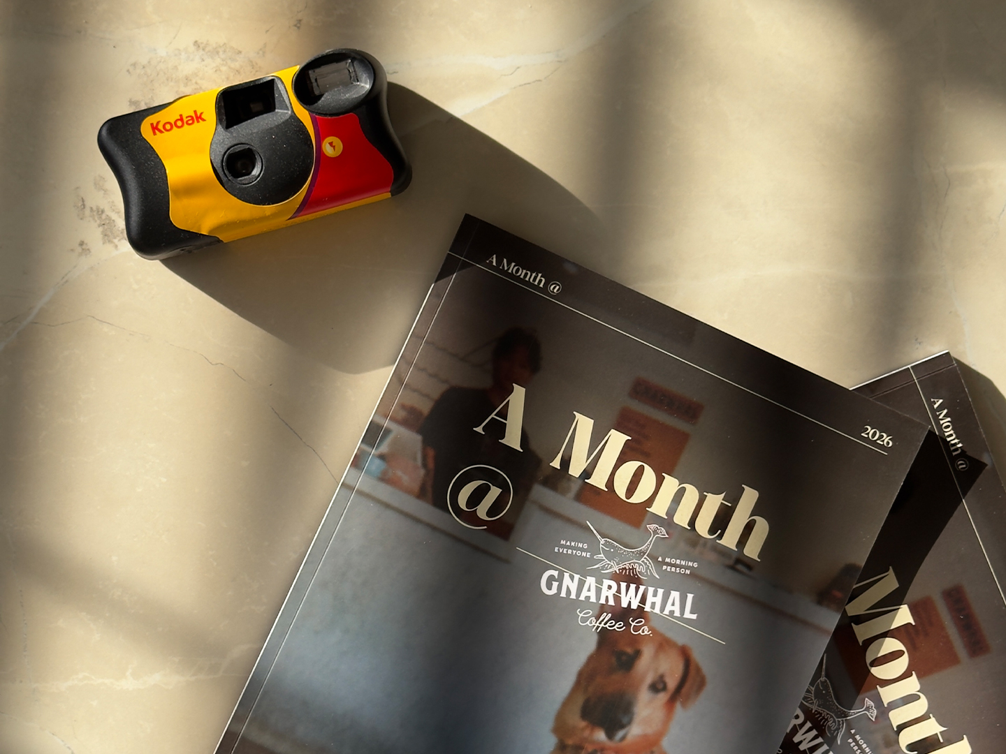
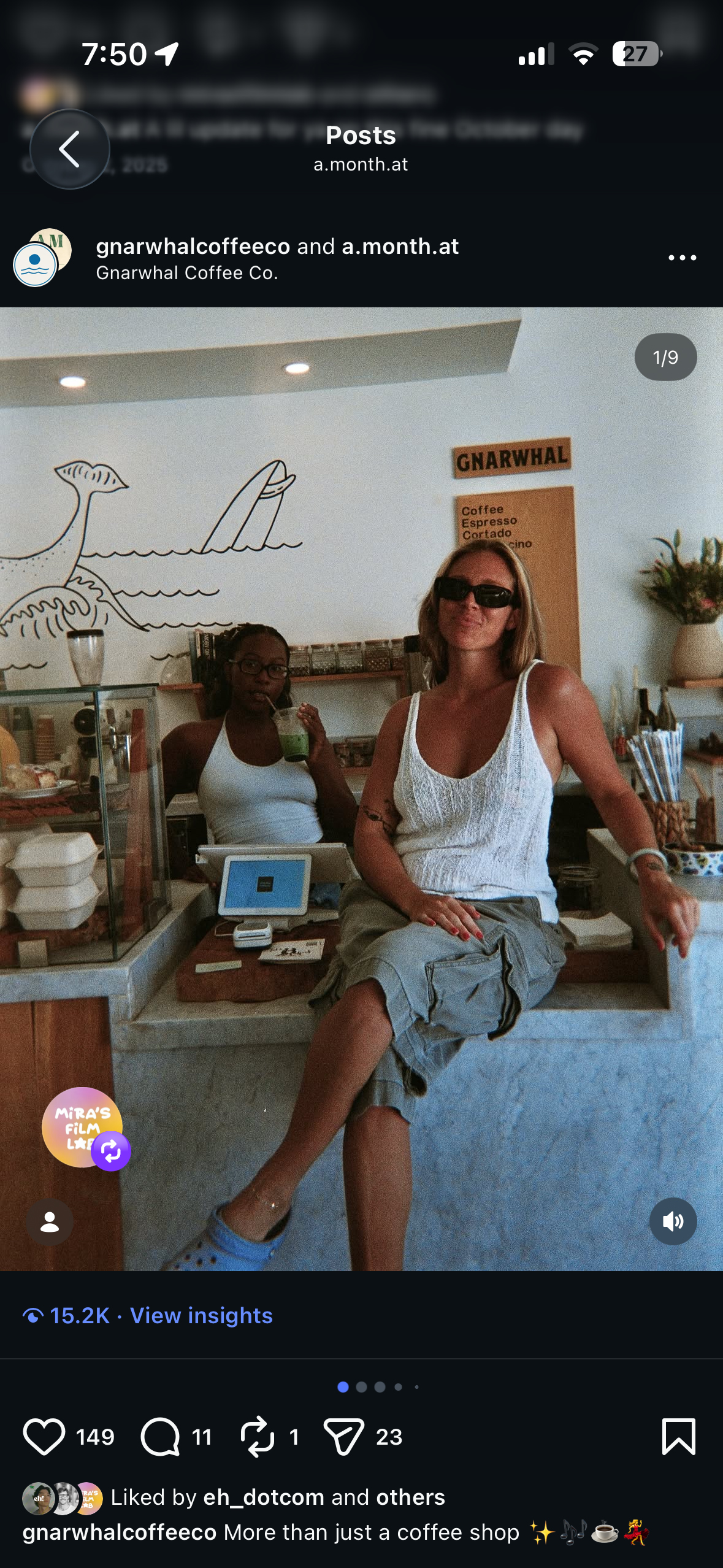
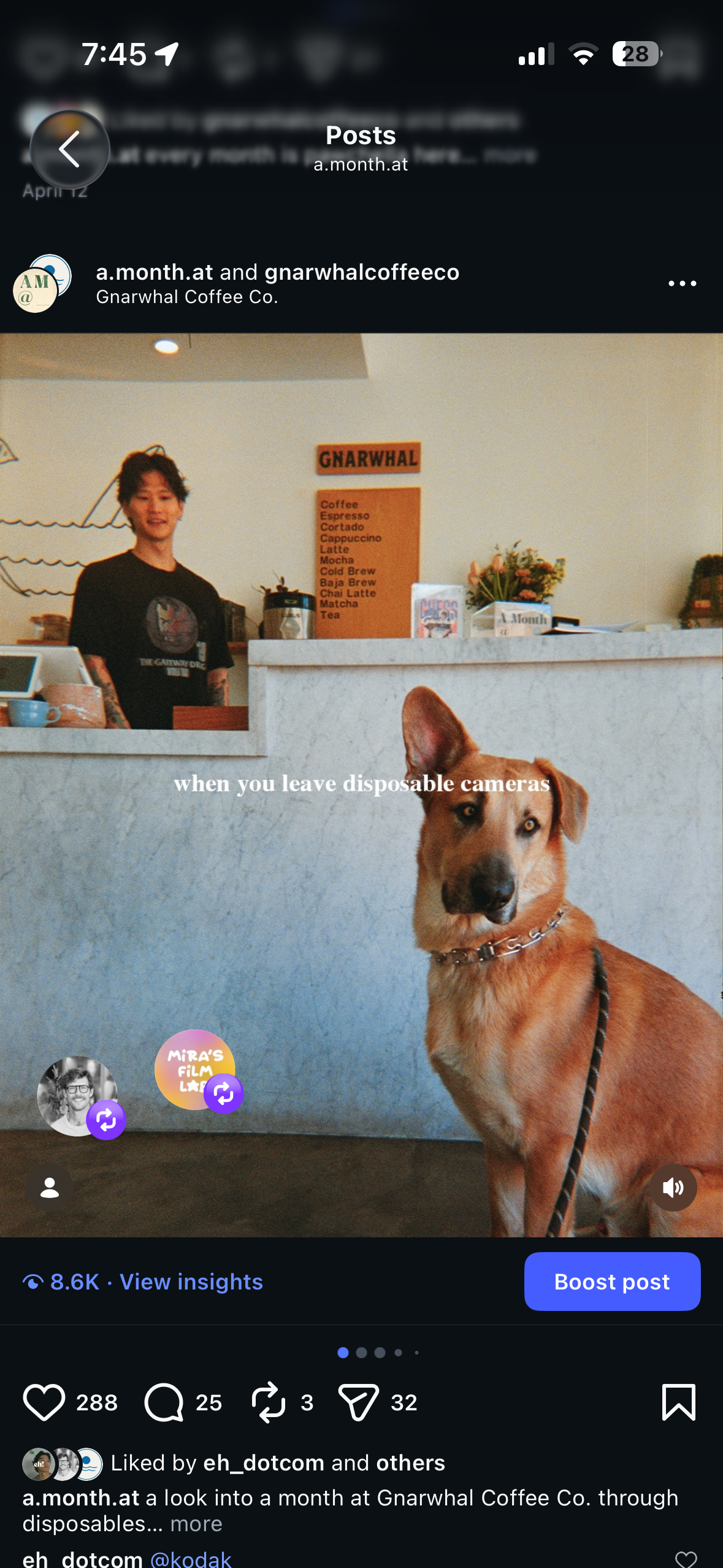
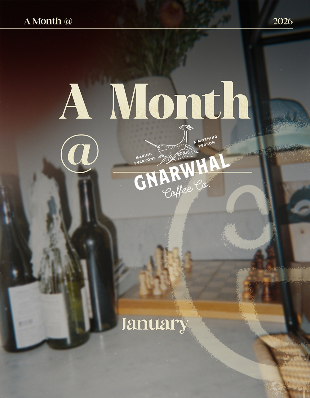
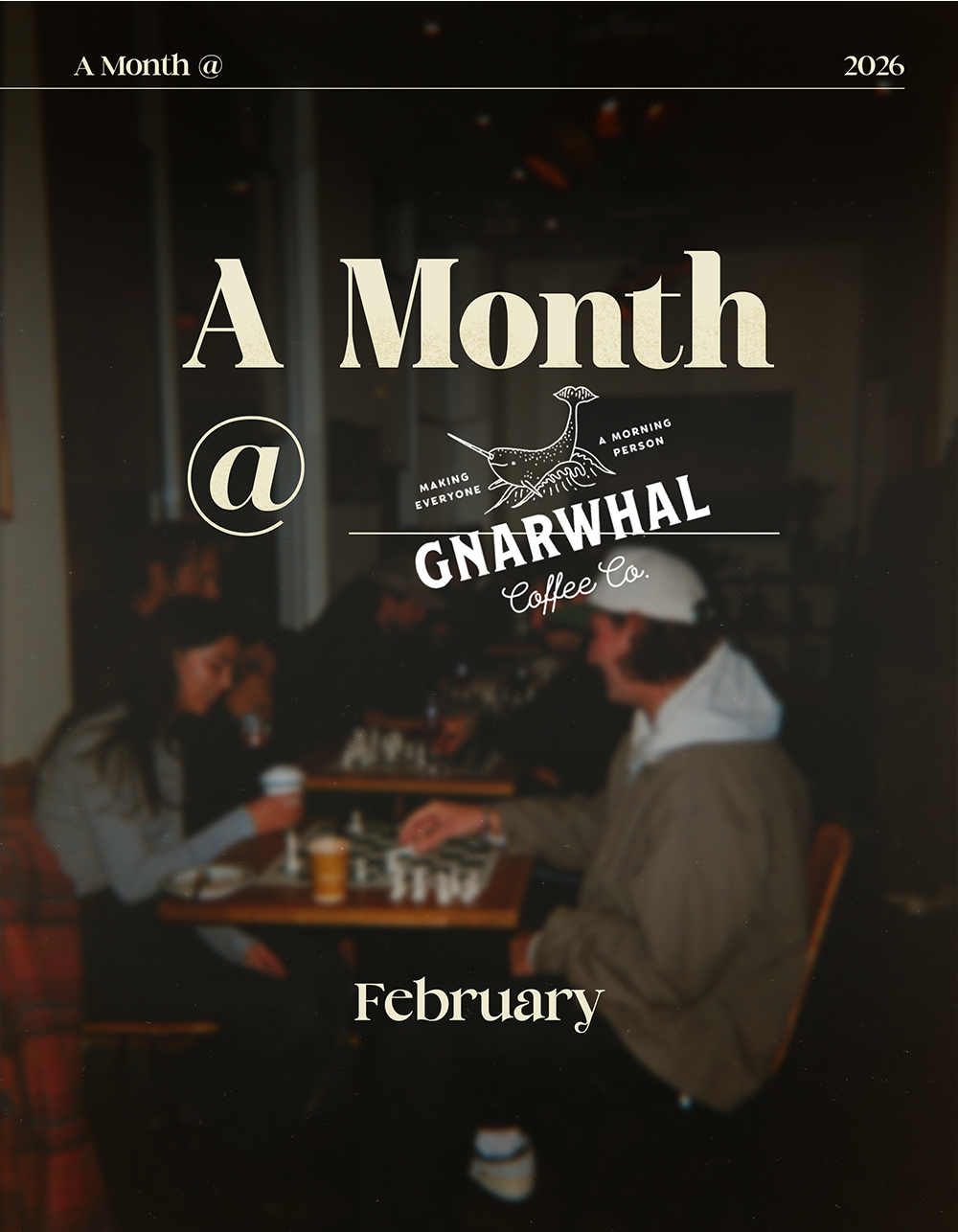
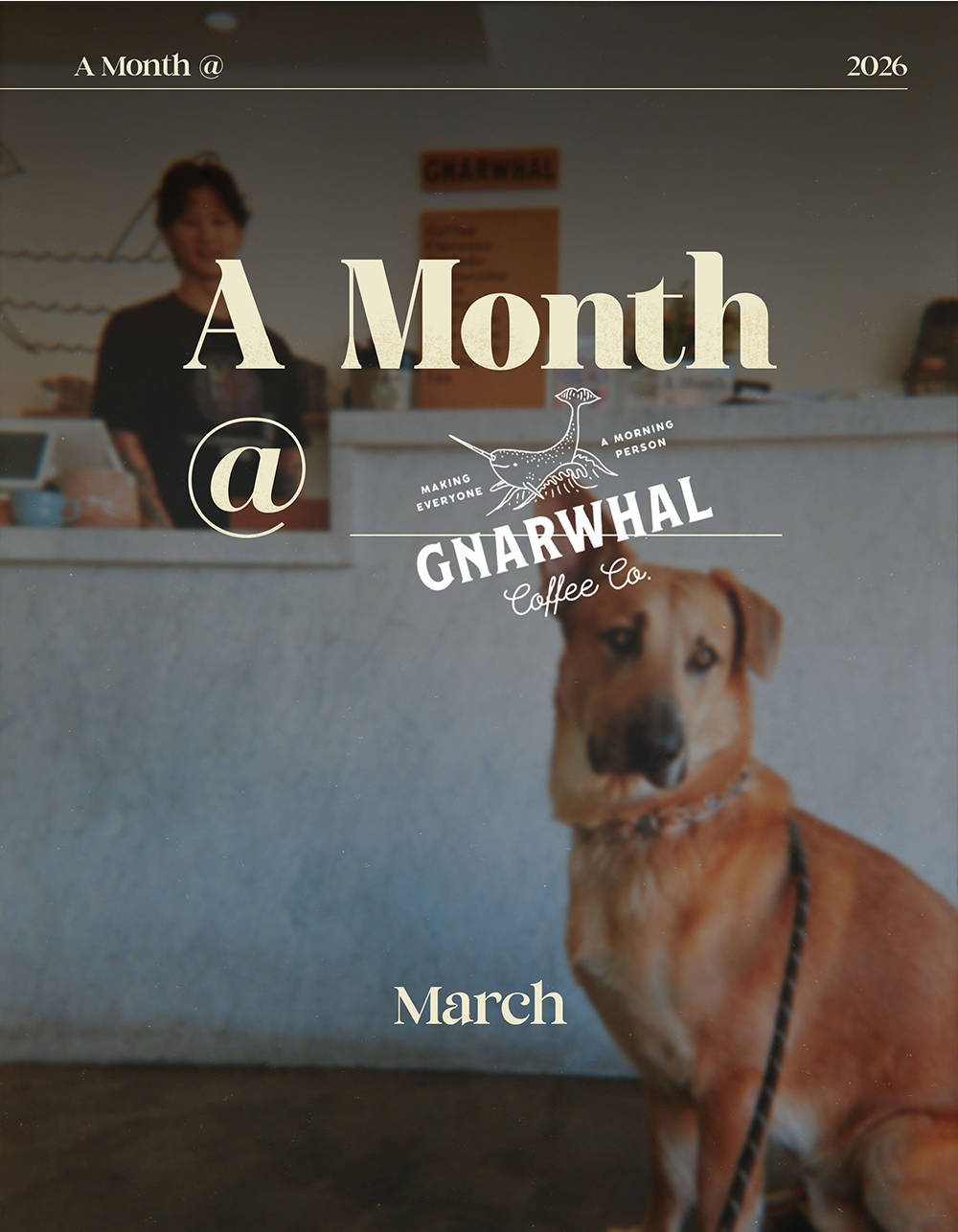
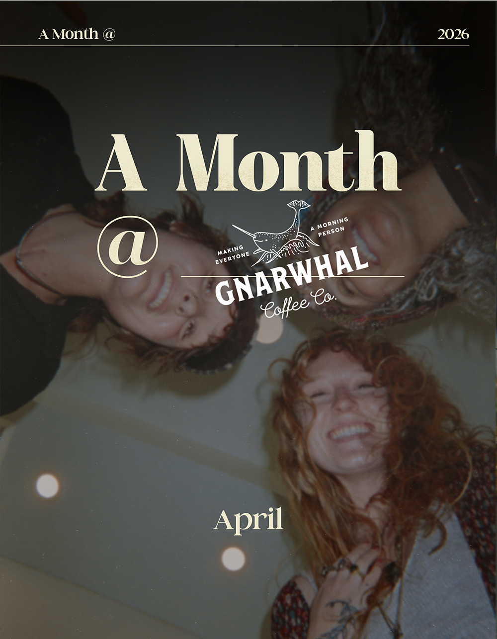
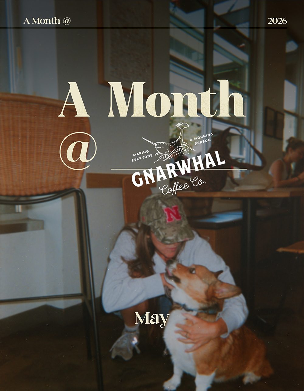
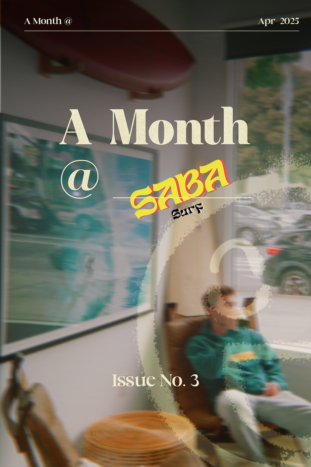
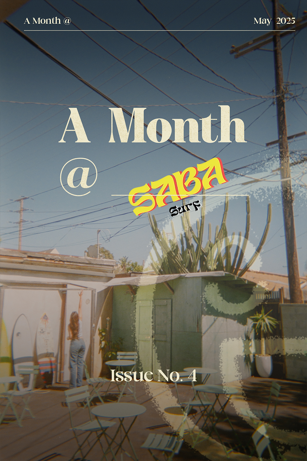
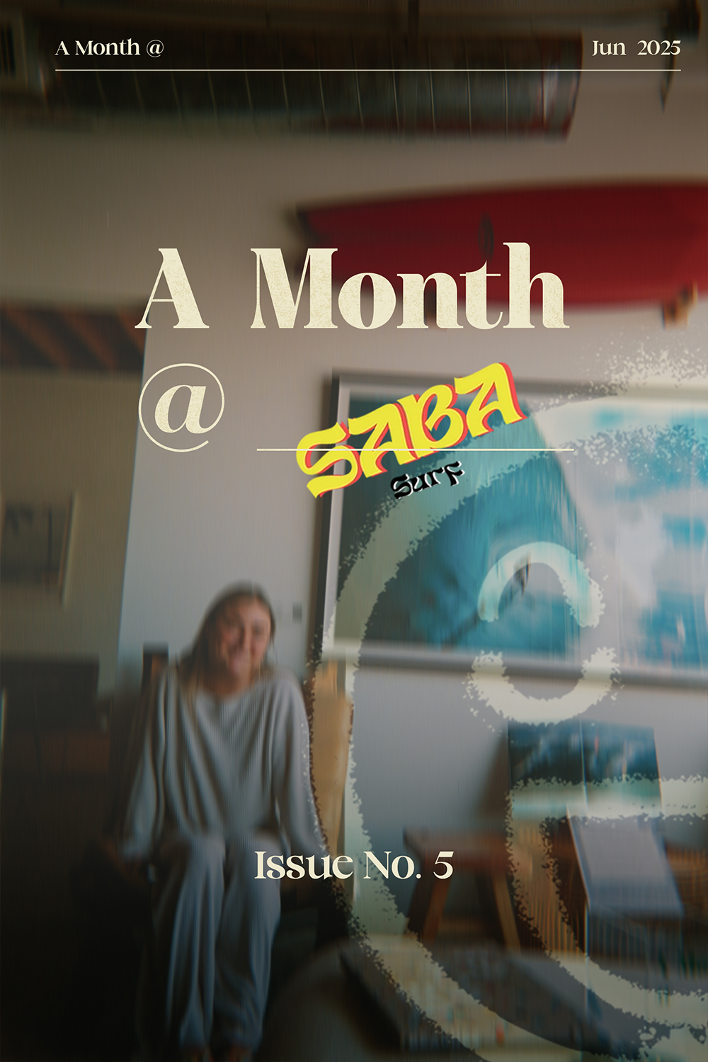
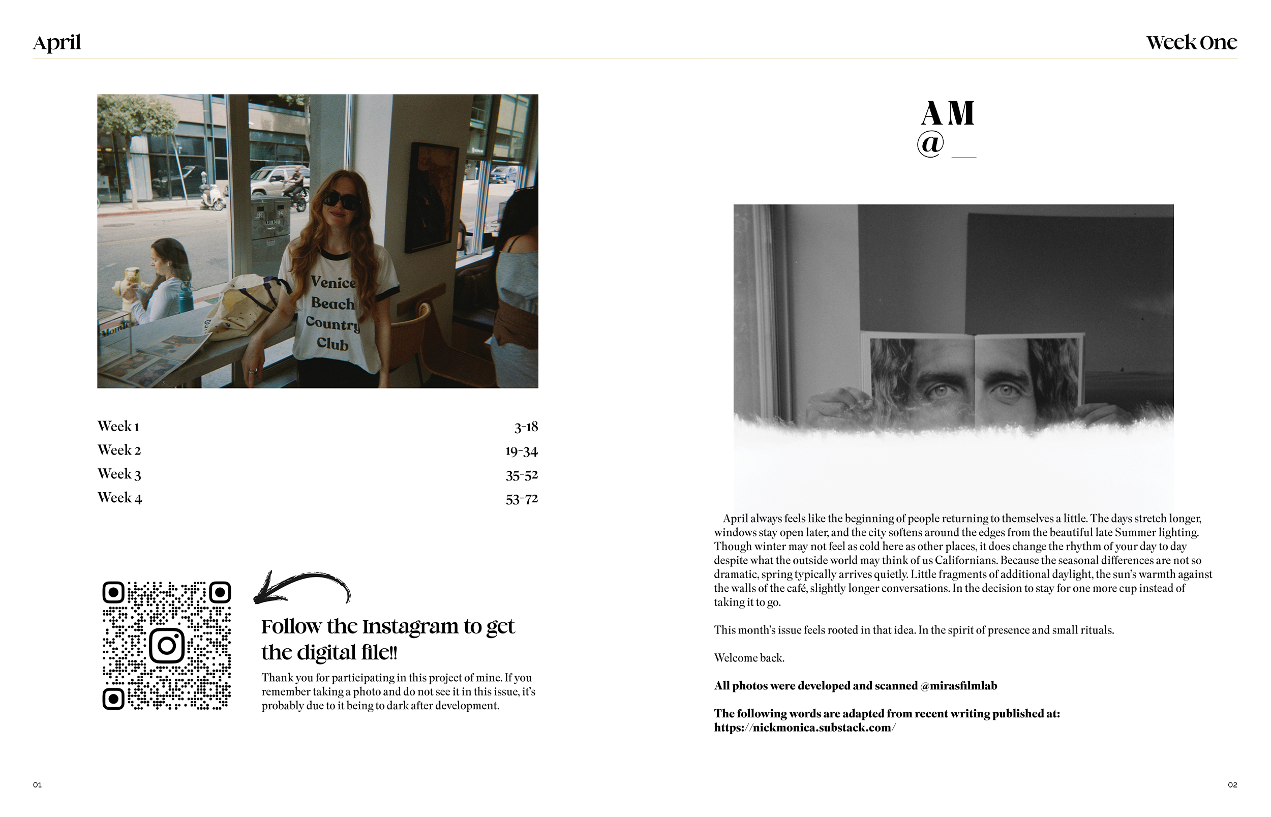
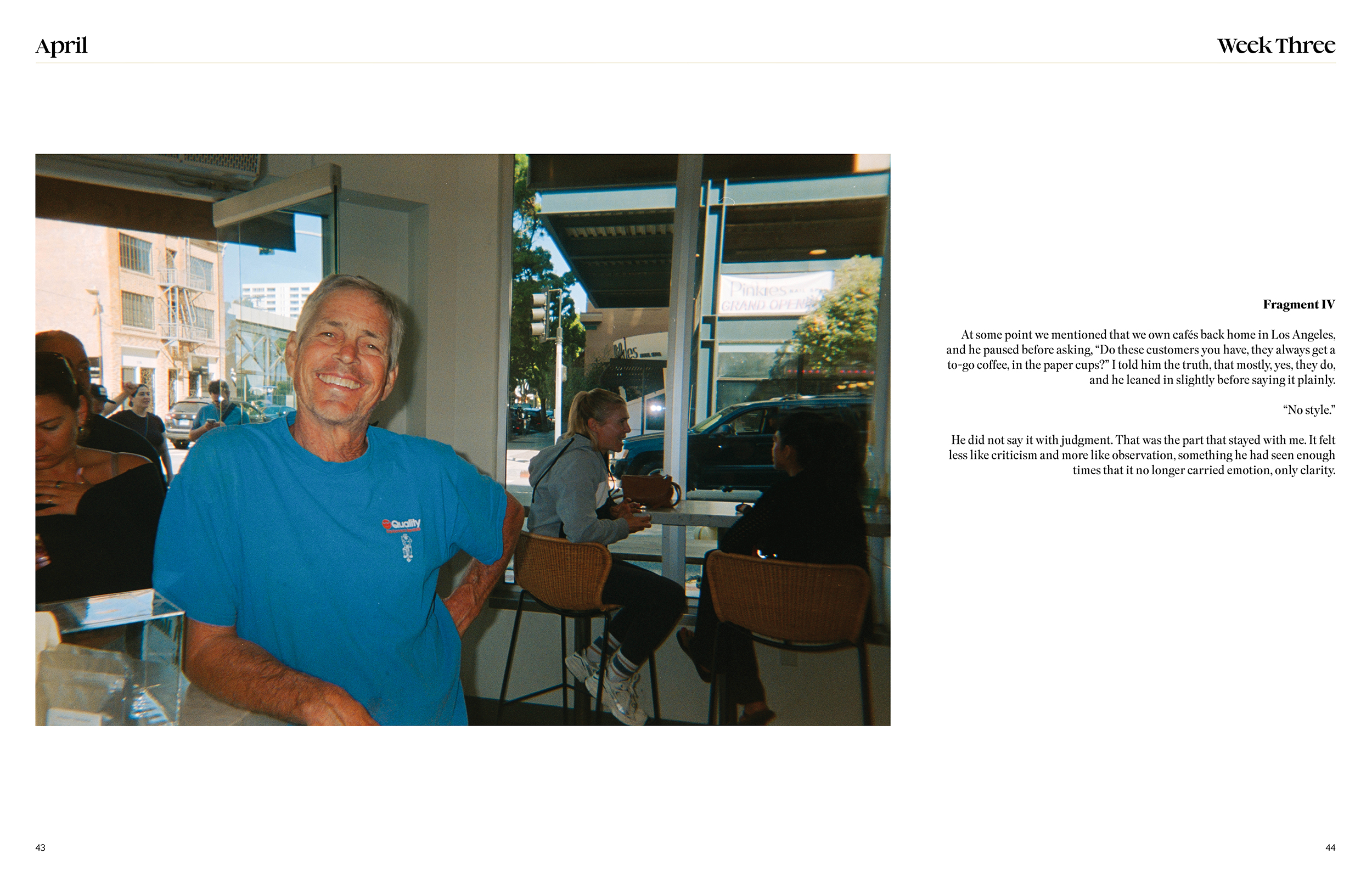
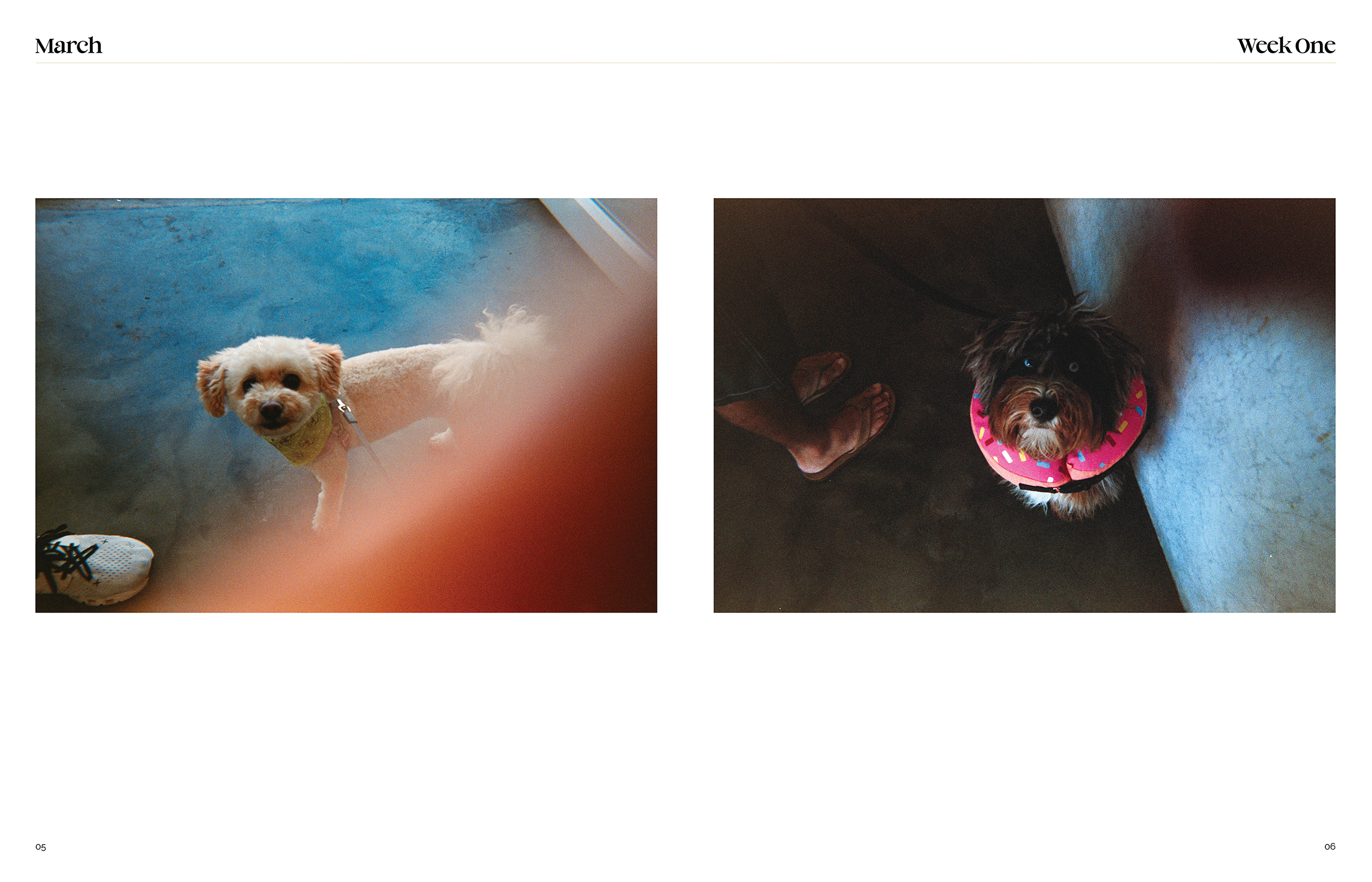
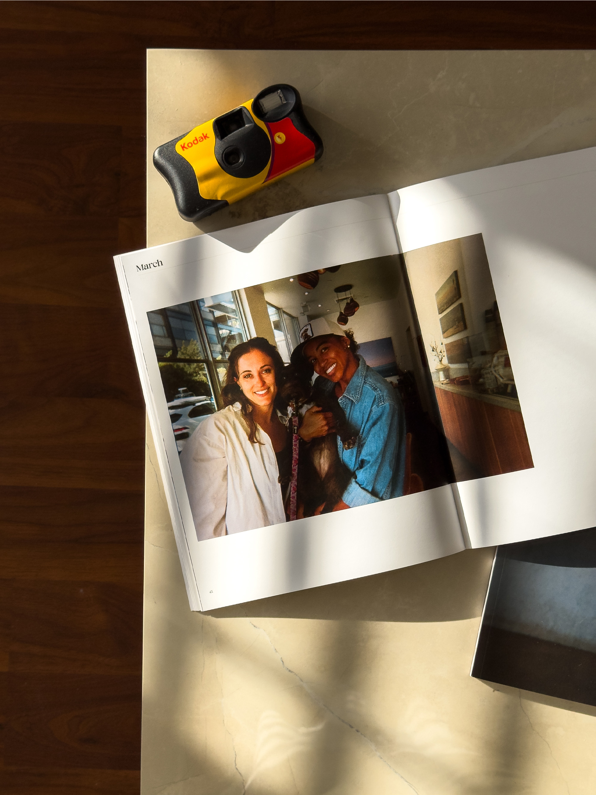
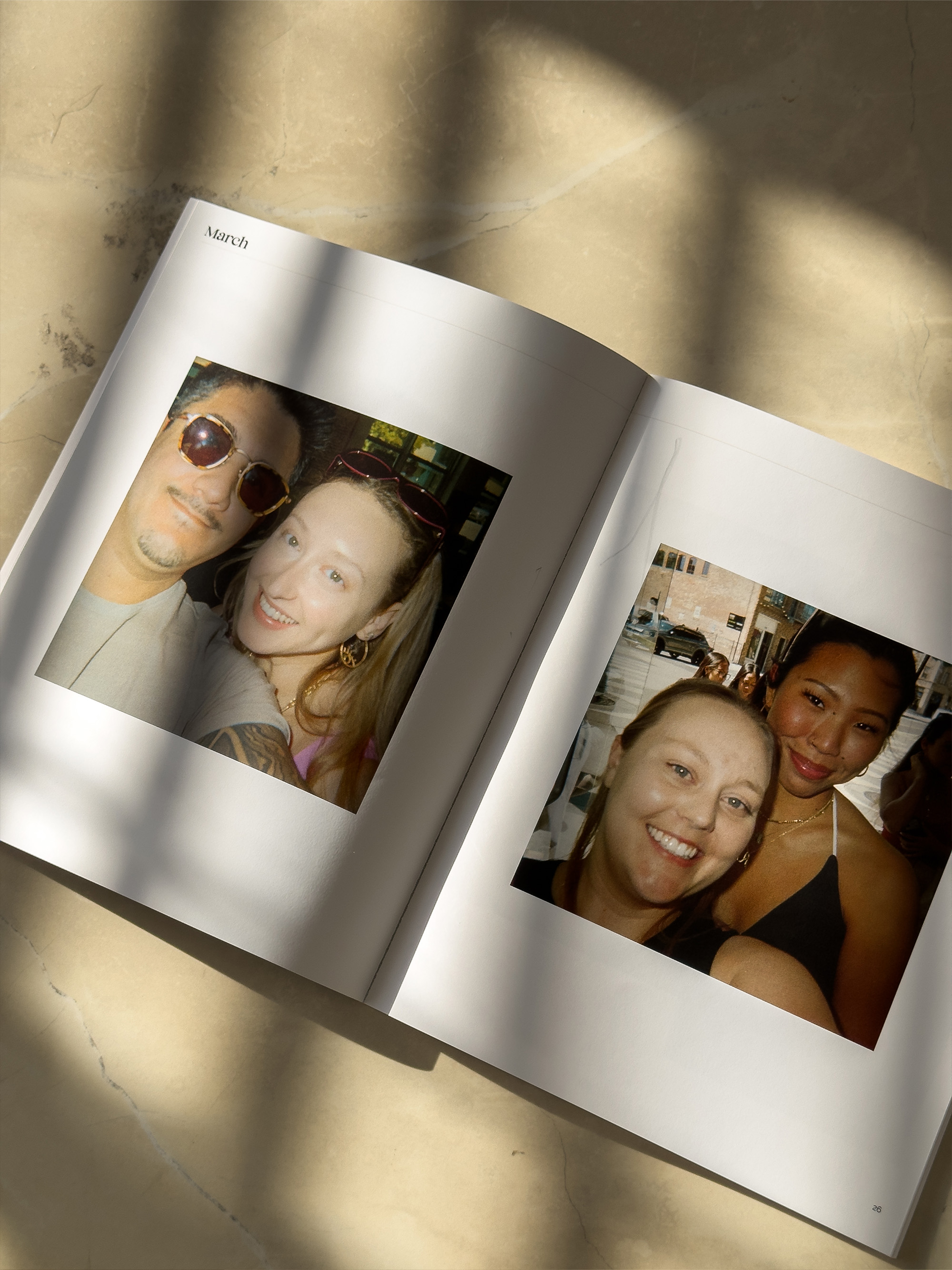
A Month @ is a community photography project I founded that embeds a disposable camera inside a coffee shop each week at a first-come-first-serve style. I wanted customers to be able to document their own experience naturally and be able to show their importance to the shop. At the end of the month, I develop the photos and print them into two editions of a physical magazine for the shop and customers to view. The project's goal is to highlight community building, and local brand identity, giving coffee shops a living, human record of their space and the people who fill it.
As the founder and sole creative, I built every layer of the business from the ground up from concept, brand identity, client outreach strategy, pricing model, production workflow, to social media presence. I designed the magazine layout and visual system, developed the GTM approach targeting coffee shops across LA, and executed the first edition with Gnarwhal Coffee Co. I also built the website at amonthat.com and developed the content strategy around community building posts to grow the brand organically on Instagram.
Results
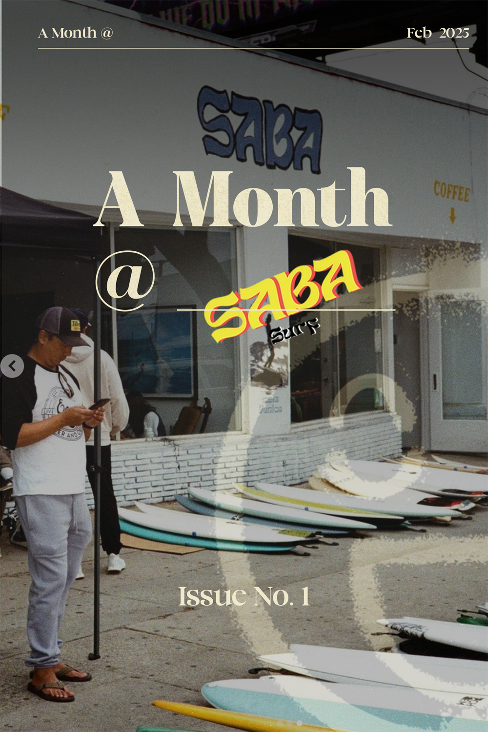
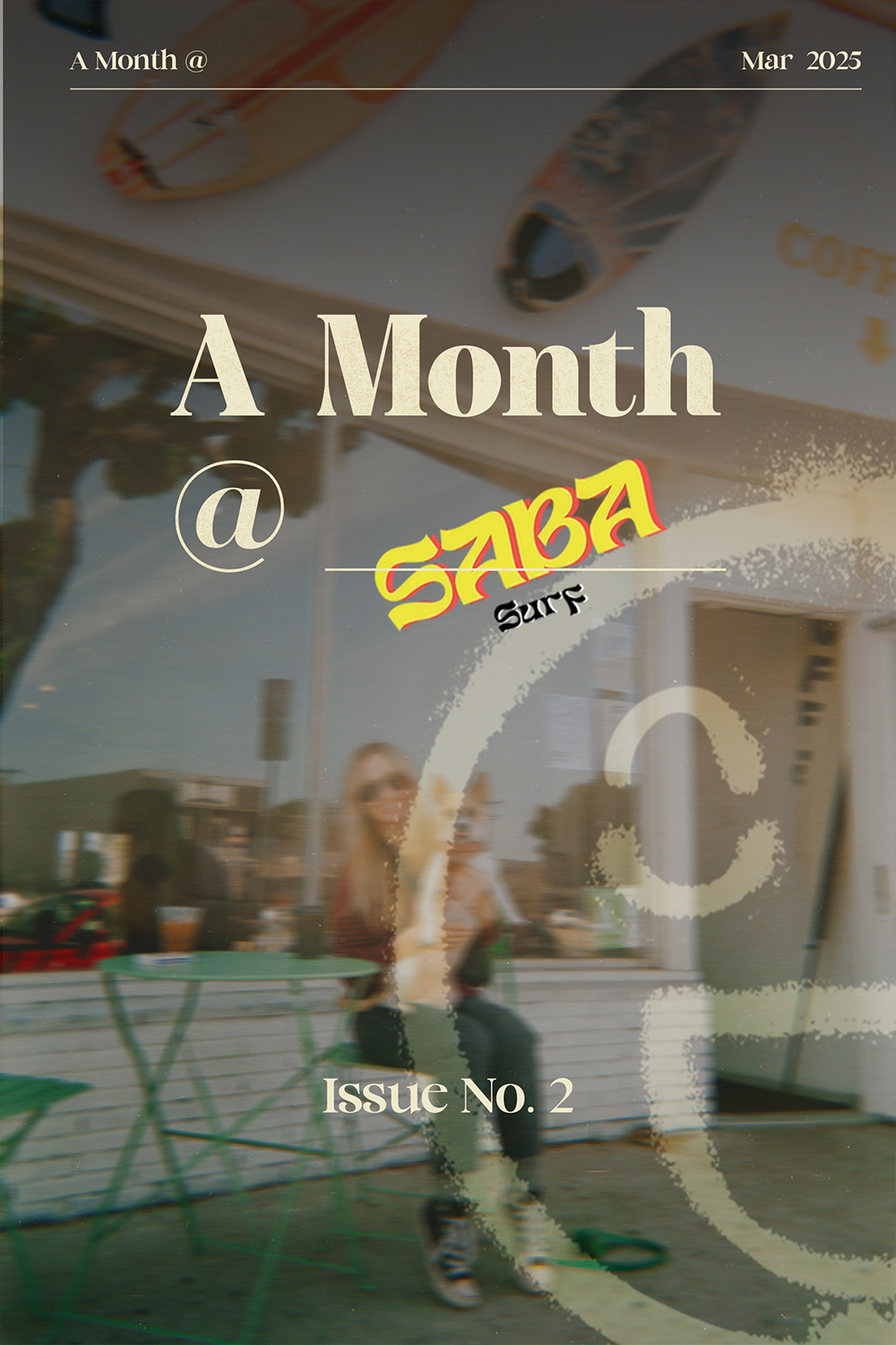
Successfully launched and completed re-occuring editions of A Month @ with Gnarwhal Coffee (and previously Saba Surf Coffee), producing a fully printed photo magazines from a month of customer-captured film photography. The project established a repeatable, productized model at $750 per shop, with higher tiers that include social media work, and a clear workflow from installment, camera delivery, to final print delivery. Early outreach across approximately 30 LA coffee shops validated interest in the concept and laid the groundwork for ongoing client acquisition.
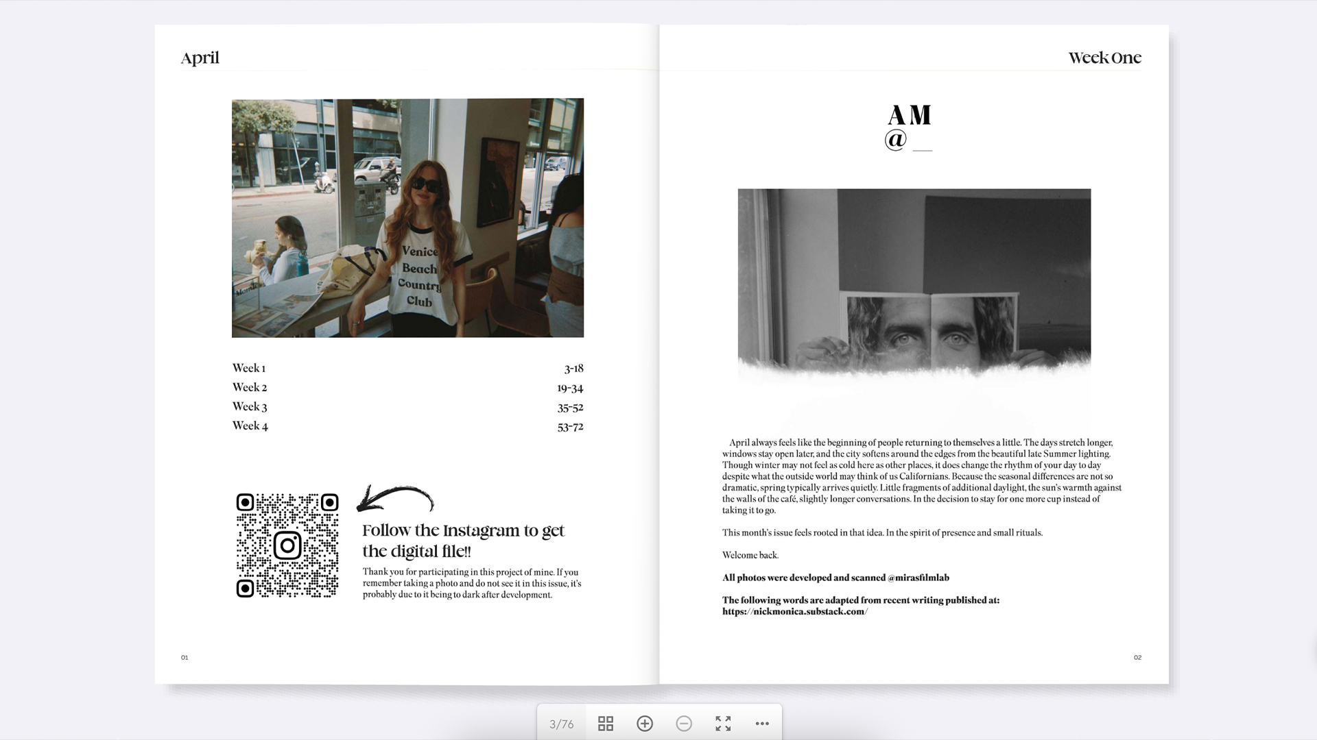
In early 2025, the magazine started in more of a "calendar" format at 6" x 9", spiral-bound issues organized by week. I'd designed four tabs extending off the right edge so readers could jump straight to a given week, but once printing was outsourced to a third party, that feature wasn't feasible to produce.
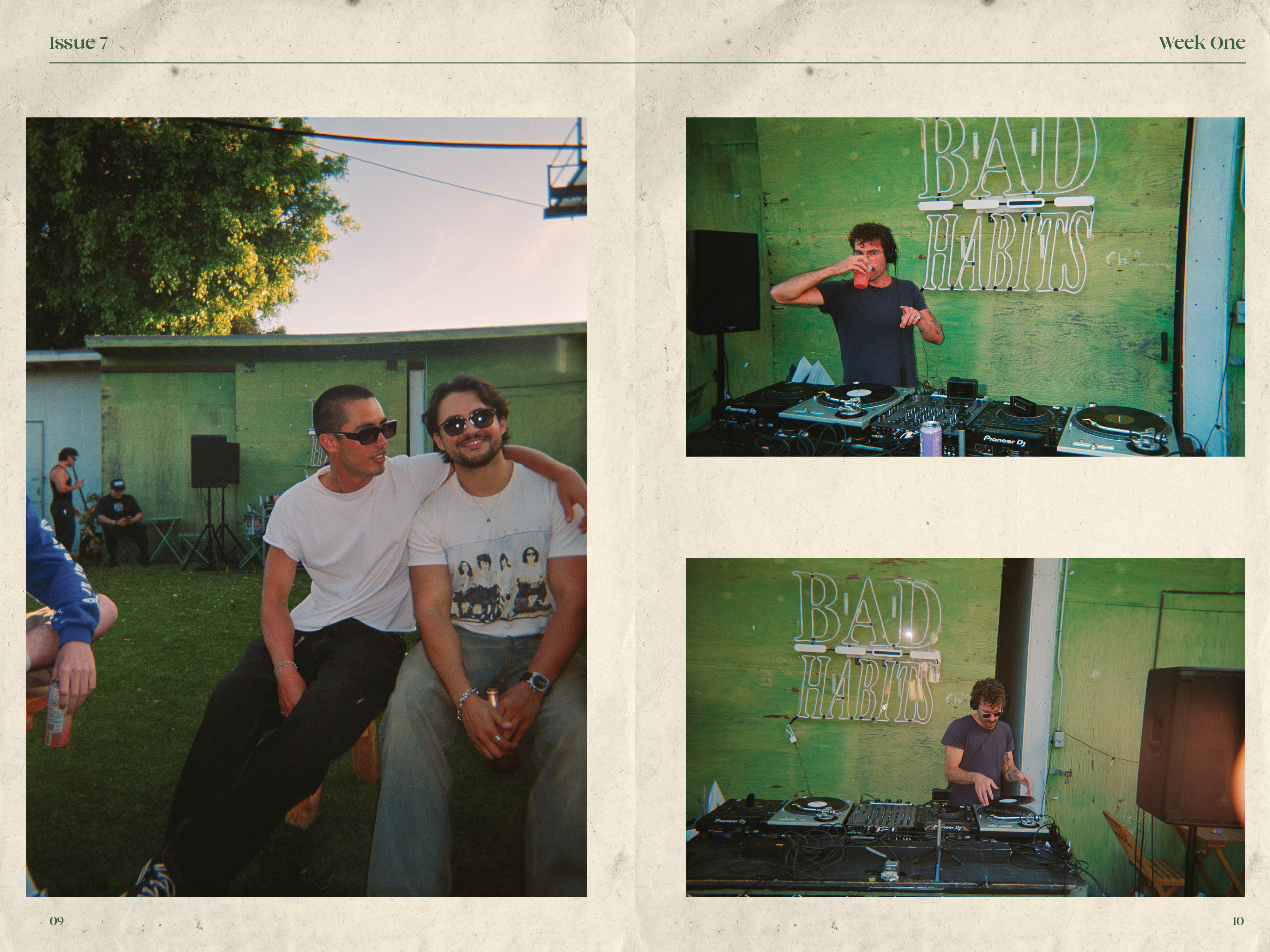
This year, I pushed the project in a more professional direction, incorporating editorial pieces written by the coffee shop owner. The magazine grew to 8.5" x 11" for a stronger photo viewing experience, moved to perfect binding, and now uses a heavier paper stock.
Page layout and photo design are driven by the photographers and photo books I find myself returning to. Specifically the way strong editorial work uses sequencing, white space, and crop to let images breathe rather than compete. That sensibility shaped how I think about each spread in the magazine.